Wednesday 29 March 2017

Module 5 Chapter 10

Degas and Pastels

I have a box of small pastels in a variety of colours, not necessarily my choice of colour but they are useful for various types of work.  I also have a small quantity of soft pastels which I purchased some years ago for a particular project.  In addition, I have a number of Markel sticks which I like as they can be used on fabric.

My first pages are using my box of colours to make marks using either the flat sides of the pastels or the sharper ends.


The bottom right is using one of my stencils with a brush.

I made three other stencils, a square, a triangle and a squiggle.

These top two pages are all pastels using a brush.


Here I have used Markel sticks.  The squiggly piece is using the outside of the stencil as an outline.

Again, using the outside as an outline and on the right, including some solid inside stencils.

I then moved on to different papers.


This paper has acrylic paint on the background and although the piece on the left appeared to have lots of colour on, when I sprayed it with hairspray to set it, it just seemed to wash off.  As it dried, the outlines became more apparent but the solid pastel had disappeared.  The piece on the right, is done using Markel sticks but again, the colour didn't take too well on the acrylic paint.


This is Markel stick on black sugar paper.

I like this one.  The background is wallpaper lining paper with a Koh-i-Nor paint wash.  I used the inside and outside of the stencil with one of the small pastels. The colours have all blended well together making a delicate design.  I used cotton wool to transfer the pastel to paper.


These two were done with the individual soft pastels.  The top paper is almost like a fabric, I don't know what it is.  It probably came in a shoe box.  The bottom piece is a scrap of hand made paper from another project.  I used cotton wool again which itself soaks up the pastel so you have to renew the colour for every line whereas with the Markel sticks you can get two or three lines from every application.  The top paper certainly didn't take the colour quite as well as the bottom piece.

Degas.

I chose these four pictures that I found on the internet.  The colours are all so different as is the intensity of the colour.  I particularly like some of his backgrounds, you could certainly incorporate those into a piece of embroidery.

These are the pieces I selected from each picture.  Where possible I have used the soft pastels that I bought seperately, the colours are much more subtle.

This lovely pale green colour with the reddish bodices goes so well together.


I liked the oranges and yellows here.  There are some strong lines in the dress skirt and bodice that I tried to copy.  I have also had a go at the background.

The shadows make the bodice look purple.  I found it difficult to get the splashes of light onto the skirt.  I think you must have to leave areas blank because using the white over the top doesn't work.

Again, I had difficulty getting the light areas in.  Also, I was restricted by the lack of shades in my pastels.  I have made the back a bit long here and again I have had a go at the background.


Here is all my work in my folder and my sketchbook cover appropriately decorated.

An interesting module, I am a bit intimidated by drawing people and yet, if you look very carefully at some of the great masterpieces you can spot mistakes like proportions being wrong but they don't notice because the piece as a whole is so beautiful.  It still doesn't make me any more confident!

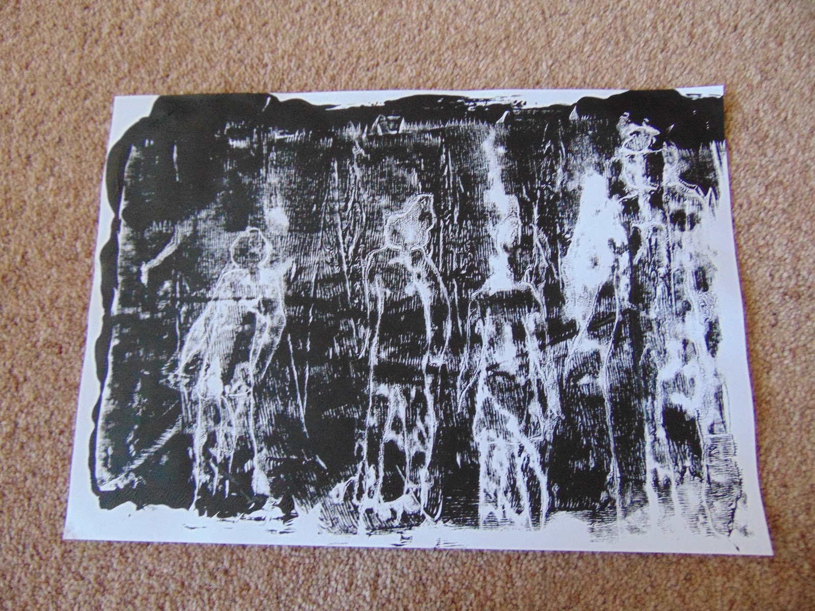
I did enjoy doing the chapter with masks and would still like to do an embroidered piece using that idea.  The crowds worked out better than I expected and produced some surprising pieces.

Friday 10 March 2017

Module 5 Chapter 9

Crowds.

Choosing pictures of crowds proved more difficult than I expected, I thought there would be loads in the newspapers and weekend suppliments but there wasn't.  However, I did manage to put these together without having to go onto the internet.


Top left is from my daughters university magazine which shows a picture taken in what looks like the 1950's.  She thinks it represents taking the chancellor to the university on the first day of the new year.  They don't look too happy about it.  Top right shows what happens to the crowd in the background when the focus is on the foreground.  All the faces in the crowd become a series of dots. Bottom left is a bit small but shows photographers at an award ceremony all facing right trying to get a shot of the new entrant on the catwalk.  The centre shows ice skaters on Central Park and looks so much like a Lowery I just had to put it in.  Bottom right is a street scene and I have forgotten where it is but it is evening and people are obviously out to enjoy themselves.

I then went looking for shapes that I could use as stencils and stamps.


I found these on the internet.  They are clear and sharp and easy to trace.


I enlarged some of them using Paint Shop Pro and then cut them out.

This gave me paper shapes that I could use to make arrangements on my paper.


I made a set of stamps then made a second set keeping the cut outs for stencils.


Drawing round the shapes with different coloured was crayons.


This paper was quite dark so I drew the outline in white pencil crayon.  I wondered what they would be like shaded in so I took a photocopy and using the white crayon I did various shading techniques for each figure.


I then tried my stencils.  I liked this one, it reminded me of people on the street at night in front of a lit shop window.

Here, I have made the figures two colours and then mixed the solid shapes with the outline ones.


These are collaged.  The light ones are glittery paper and the dark ones are printed tissue paper which I did on a course a couple of years ago.


I drew round all these figures with a gold pen first but they didn't stand out until  the light caught the gold so I then edged them in black felt tip which gave the gold a lift.  I then cut out thee of the figures in painted paper and made them slightly smaller than the drawings, trimming them where other figures overlapped.  I liked this idea and the stripey paper went well.

This is repeating the technique from the Keith Haring work.  I cut the figures out from one page of a magazine that had several individual picture on it.  I angled the shapes so that the white lines were not straight on the figures.  Putting them together in this way, the white lines make some interesting shapes.
I then went onto monoprinting.


Here I placed these shapes inside a plastic wallet, I then painted the wallet, following the shapes.  I put all the paint on before printing because I was unsure whether I could line the figures up each time.  I'm actually quite pleased with this one, I think all the figures have terrific movement.
I then tried printing each figure in turn.  Again, they turned out better than I expected, some of them look as though they are pictures of all the muscles in the body.  This will have been created by the paintbrush I used to put the paint on with.


This was painting up a plastic sheet and drawing into it.  I used a piece of paper that I had laminated first and it makes a good surface.  However, I have got too much paint on here.  I am very unsure about trying to draw quickly into to the paint especially if it is supposed to represent something specific. So this first print was not successful. I used the end of a paintbrush to draw with.

I did another pull as the drawing was still in the paint and this one is slightly better.  Don't think I would use this technique very often unless the drawing was abstract.


This time I inked up the plastic and placed a sheet of paper over it and drew on the back of the paper with an old pen trying not to lean on the paper.  I was pleasantly suprised with this one, it came out better than I expected.

Because the drawing was still in the paint, I pulled another print.

Then I tried a third print.  Not quite so successful but useable in the right place.


I then got my gelly plate out.  Firstly I painted the plate and then put a piece of netting from a fruit bag over the paint.  I printed the paper with this, removed it and the netting.  I placed the paper cut out figures on the plate and ran some more paint over everything. I then printed the paper again.  I did two prints like this.


Here I place the paper shapes on the gelly plate and then painted the whole plate and took a print on paper that had already been painted.

The left hand print is a second print of the one above but on white paper.  The right hand print I added more paint to the plate then added the netting and took a print.


These are my paper shapes after I removed them from the gelly plate.  Unfortunately the man lost his head but the rest are going onto the cover of my sketchbook.

I wrote all the details on the back of each print and I have then stapled them together in their different techniques and they are now all in my folder.

I was a bit nervous about drawing crowds but the shapes I found made it much easier for me to manage.  I quite like printing, especially onto fabric but you need to have really planned it out first to make sure that your ideas will work.  Doing the prints on paper first will be a big help and I shall do that in future.