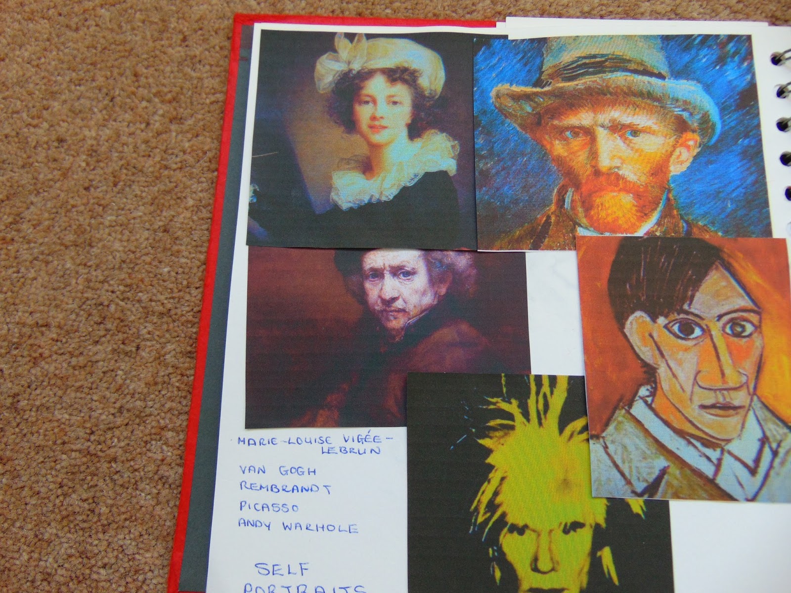
Thursday 29 September 2016

Module 5 Chapter 4

Your own face.

I found this quite hilarious at times.  The funny images while drawing with your eyes shut and then the difficulty trying to get a picture to look a bit like you do.  Maybe I should start with a photograph of what I really look like.


Firstly drawing with your eyes shut and using your non drawing hand to guide you over your features.


I think I can see where Klee gets his ideas from!  So I had a second go this time using charcoal instead of pencil.


Not sure where my nose went.

I then did two continuous line drawings this time looking in a mirror.  In all these four, I have removed my glasses.


Done with charcoal and still doesn't look like anyone.


This was done with pencil and may be getting nearer.
I then did the observed self portrait drawing, the first one in charcoal without my glasses.


A bit better.  Looks a bit more like a human being.

This second one is in pencil and I have plucked up courage and put my glasses on.  


I am not sure that the glasses have improved what I am seeing but I am growing to like this one.  Noses are extremely difficult to draw.  

A very difficult chapter for me.  I found it hard to put all the shading in and not get it too heavy. I also think I subconsciously missed a few lines here and there.


Module 5 Chapter 3

Artists Self Portraits

I found the following self portraits on Google Images.

Van Gogh.  One of my favourite artists, there is so much texture in his paintings.

Rembrandt.  I love the series of self portraits so that you can see him age. His eyes are quite hypnotic.

Marie Louise-Elisabeth Vigee-Lebrun.  Apparently she was noted for her wit, beauty and charm and I think this comes across in her painting.  She did many portraits of Marie Antoinette.

Picasso.  Quite a young man here but a few lines can portray strong features.

Andy Warhol.  This photograph has been produced in many different colours on the black background.  The head seems to float in mid air giving it a supernatural feel.

I have trimmed the photographs and mounted them in my sketchbook for future reference.

I was looking through books that I have at home and found this self portrait by Albrecht Durer.


This is the first time I have used watercolours to produce specific colours.  As you can see I had problems trying to get the shadows around his mouth and chin and he has ended up looking as though he has a dirty face.  I found it difficult to get rid of the hard edges of the paint but still keep it within a certain space.  He looks a lot more feminine in my painting and I think that is partly due to the tilt of the head that I have given him.  It probably wasn't the easiest choice to paint but I enjoyed doing it.


Sunday 4 September 2016

Module 5 Chapter 2

Hands and Eyes

I took the hand exercise on holiday with me and sat on the plane out drawing hands and on the way back I did section 3 creating patterns.

This first one I did before I went as I wanted to make sure I could do it whilst travelling.

I have put too much detail in I think.  The knuckles are two circular and I had trouble highlighting the large veins.  Looking at my hand now while I am typing this, I do have prominent folds of skin on my knuckles but I have omitted the bones showing down from my fingers.

This is better.  I don't take my rings on holiday as my fingers swell in the heat and I can't get them on and off.  I much prefer this drawing.


I haven't quite got the curve of the fingers right here and the hand is a bit thin.


This one is better.  The fingers could be a little bit longer but I have got the creases in my palm a bit better.


This one looks as though I only have four fingers but my little finger is curved round the back and is out of sight.  Again, I haven't got the curve of the two upright fingers correct.

Quite a difficult exercise this one.  I think I need to keep practicing, taking time out to do other things means you have to go back to the beginning again.

Activity 5.2.3

I cut out two hand shapes, one open one closed, to draw round and make my patterns.

This is the first one I did to show my shapes.  This first three were drawn on the plane and then coloured afterwards when I got home.


Here I coloured the background in squares of colour using a straight line in one direction and a wavy one in the other.  I then outlined my shapes in black felt tip.


Again, I coloured the background first, this time in stripes of three colours.  I then filled in the hands in black and white acrylic paint.  I went over the white with a gouche but it still doesn't cover completely.


This one has coloured patterns over drawn ones in the background.  The overlaps in the centre make some interesting patterns.


I like this one. I just sat in front of the TV cutting out shapes from a travel magazine.  The bright colours all mix well and create a lovely sunburst design.

Eyes

I have a copy of The Art Book as well as a number of back copies of National Geographic, so I sat and thumbed through them looking for interesting pictures.  Art Book first.


I love this picture, everyone is watching everyone else and you can tell they are suspicious of each other each one knows that one of them is a cheat if not all of them. I think it shows how expressive eyes can be.

This old man has a lifetime in his eyes.  He looks tired but there is still life in him.

I much prefer this lady to the Mona Lisa.  I think she is much more enigmatic, more watchful.

What happens when you can't see a persons eyes.  They seem to loose character and this figure looks quite menacing.  The different medium makes him look much harder, there is no soft light or edges to make him look more human.

Children can have such expressive eyes.  This little group were looking towards where there food was coming from, their hunger shows clearly in their faces.

This little Indian girl has such beautiful, soulful eyes. 

I'm afraid there isn't much soul in my attempts at drawing my own eyes.
Activity 5.2.4

This first attempt was done with pencil the second one is while wearing my glasses.  I'm not sure either of them look like me but one thing I can certainly say, is my left eyebrow is definately higher and slightly different shape to my right and my glasses do not sit straight across both my eyes.  We do have a 'good' side for photographing and I can clearly see the differences in my face.


I was a bit nervous about doing these two but I actually think they are much better than the two done in pencil.  They are freer because I could not rub them out and had to just go with what I did.  The top one is charcoal and the bottom one is Koh-i-noor paint.  I prefer the charcoal as I was able to smudge the shadows and painting straight onto paper is quite hard to manage.  Still not sure they look like me though.

The drawing is becoming harder now and I need to keep practicing.  I intend to try and draw something every day before starting on the next chapter.


Module 5 Chapter 1

Making a folder or pocket book.

I decided to use some of these envelopes that I had on the shelf.  We recycle loads of envelopes at the library as the Trustees pass paperwork round and my daughter had given me these leftovers from a job she had done.


They are really sturdy brown paper and have inserts in the sides for putting large quantities of paper in.  I decided I needed to cover the printing on them so I used a technique we had demonstrated at my textile group, using black, red and white acrylic paint and a variety of childrens painting equipment.

 This is one side of the printing

 and this is the other.  I removed the flaps as I didn't think they had any purpose for this exercise and I used them for trying out the paint.


To join the envelopes together to make a book, I stitched a Greek key pattern in black down the full length of a piece of calico I had.  I tore the strip off which gave a frayed edge and threaded it through holes I had punched in the envelopes.  I couldn't make a proper stab stitch finish as I didn't have a long enough piece of fabric so I just went in and out of the holes from bottom to top and then back down again.  The ends are finished with two beads.

I was quite pleased with this.  The printing is hardly visible and the envelopes make a useful book.  Might do this again for library paperwork!