This is quite a big chapter so I have got all my books and course details spread out on the computer. I have not done the zentangles or the extra activities yet as I will take them on holiday with me to do on the plane and will post them with chapter 3 when I get back.
Leon Ferari, Susan Shie and Dave Foster. I looked these up on the internet and chose a picture from each one to put in my sketchbook. To make it more interesting, I tried to do a piece of work in a similar style at the side of each picture. Susan Shie is very colourful and obviously topical without you having to read it.

.JPG)
Hope these have come out OK, they don't look too good on my screen.
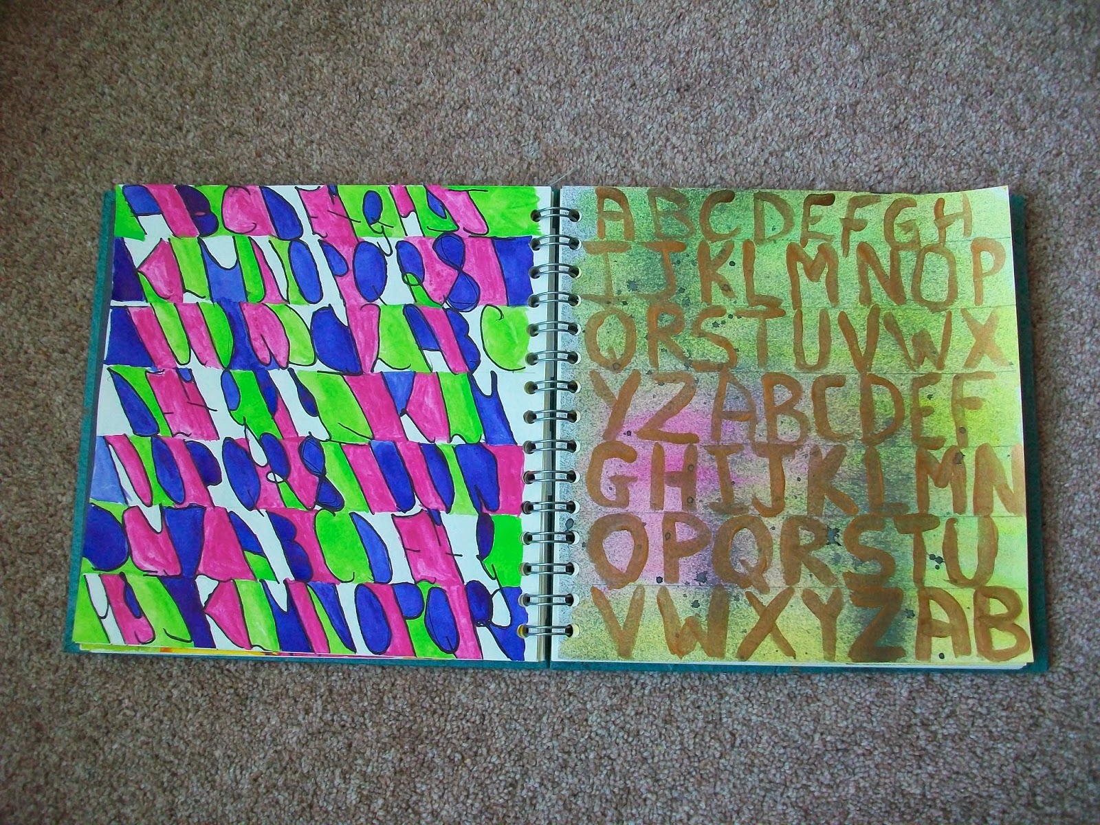
2.2.1
The picture above shows the first page of the next exercise. Each piece of writing describes what I have written it with, except the first two which are biro and show my real handwriting and how I had to write at school.
Page 2 is felt tip pen and coloured pencils with the writing going up and down as well as across.
Page 3 is using the caligraphy pen again and overwriting with two fine tipped felt pens together.
.JPG)
Pages 4 & 5 are various ways of writing, mostly done with a fine felt tip then coloured and highlighted.
.JPG)
Adding colour
Pages 1 & 2 of this section. Gold markel stick overwashed with diluted ink. Page 2 is metallic pencils (which are not metallic at all) overwashed with water.
.JPG)
Page 3 is thin black card Top is written in silver pen overwashed with pearlised ink. Second and third rows are pearlised ink overwritten with silver and gold pen. I've then written with gold, silver and black directly onto the card to see how well they look and silver looked the best.
Page 4 is Markel stick on a piece of my painted paper from the stash.
.JPG)
Page 5 is painted brown paper written on first in oil pastels but they are really dry and I have now thrown them away. I finished it off with inktense crayons used just as they are. Page 6 is Koh i Noor background with artist ink writing using a dropper.
.JPG)
Page 7 on the right is black tissue paper painted with ? I think it is ink and then written on with a white and gold metallic acrylic paint. The one on the left is Markel stick on tissue paper overwashed with a watered down ink. You can hardly read the writing and you can still see through the tissue paper.
.JPG)
So I tried putting it on vaious other backgrounds and tin foil seemed to work quite well. You can read the writing if the paper is catching the light right.
.JPG)
Pages 9 & 10. Page 9 is a cheap grey paper used in a shoe box on which I have stuck strips of newspaper and painted it all with Koh i Noor paints. The writing is done with a dip pen and ink. Page 10 is one of my favourites. It is black card with pastels writing hot words in hot colours across the page and cold words with cold colours down the page. I sprayed it heavily with hairspray to stop it smudging.
.JPG)
This was an experiment but it works quite well. It's pink florists cellophane and I have used a fine felt pen on the first piece, I then ironed it between pieces of baking parchement to shrivel it up. I liked the effect but realised that you couldn't see the writing very well so I did it again using a blue permanent marker.
.JPG)

This first two pages, I have followed the word rather than the letter. Having realised my mistake, I wrote another word down on paper and worked round it so that I knew what I was doing. I then did it in my sketchbook using paint straight away and did the same mistake. I rescued it a bit but it could have been so much better. I think it's using paint without first drawing your design, it felt a bit bulky. Hopefully my zentangles in black and white will come out better.

This is writing in circles. The first one starts with a fine pen in the centre gradually getting thicker and larger letters as it reaches the outside. This creates a tunnel effect.

This second one is more random, using different tools and varying the size of the letters. I quite like the effect it gives. Also there is the addition of the permanent marker that soaked through from the other page which creates a shadow effect.

Capital Letters.
I've got plain letters at the top and bottom and curlier ones in the middle all done in ink and dip pen. I've deliberately washed over the curly letters to make the ink run a bit. The colour is water soluble pencils with a water wash. I started colouring in a certain order but then got more random as I needed colour in different areas.

The page on the left is to celebrate left handedness. The letters are black felt tip and the colour is koh i noor. I really like the design this gives from a distance, you cannot see the letters until you get close up.
The page on the right is koh i noor paint with Brusho shimmer spray in charcoal (does everyone else get covered in spray paints? They seem to go backwards instead of forwards and my Gazinia on the windowsill is looking a bit darker that it did). The writing is bronze acrylic. I liked this page and didn't want to spoil it but I wanted to see what shapes you could get from it.

This is the last extra activity. I drew this design using my initials AMC. I scanned it into my computer and I have managed to make a mirror image but I can't put the two together. I don't have a drawing programme so I may do this the old fashioned way using tracing paper. If I colour it, I will be able to to the colour changes in the same way we did in Module 1.
.jpg)
.jpg)