Activity 2.1.1. Fonts
I have only used the fonts on my computer. I am a bit wary of downloading things now since my computer was hacked into last year. However, I think that there is a reasonable variety on Word and these are some of them.

These two are just a selection of fonts on white copy paper and the back of a brown envelope

Here I have printed in red on newspaper, it reminded me of the joke 'what is black and white and red(read) all over? I often use the Word Art option in Word when making posters and tickets, it can be quite effective but I can't work out how to change the colours.

The one on the left is on mulberry paper, the single red letter gives a medieval feel. The printing at the bottom is where I put it through the printer but it jammed so I turned it round and tried again. The one on the right is a thick tissue paper with a logo on it. I particularly liked this one and have put it in my sketchbook. I have printed in a pale blue first and then a darker blue over the top.

The one on the left is on sugar paper and the one on the right is a piece of my own painted paper from Module 1. That one used a lot of ink, I had to leave it to dry for quite a while.
Activity 2.1.2 Topsy Turvy Printing

My brain had a bit of a problem with turning the paper upside down to put it back through the printer. The one at the front is just lettering printed over the top of each other with a colour wash painted on afterwards. The top left is also printed one over the top of the other but here I have used a very pale blue for the background print and a black on the top. The colour wash is two shade of blue and then a pearlised paint on the top. I do quite like this one and will put it in my sketchbook. The one on the right I managed to do properly and turn it upside down. I might have another go at this technique as I think the choice of fonts will make all the difference.
Activity 2.1.3 Collecting words for inspiration.
I am a bit short of items here. I had some advertisements in mind but they haven't been in my newspaper magazine recently and as I explained, I am a bit lax with my camera but here is what I have got.
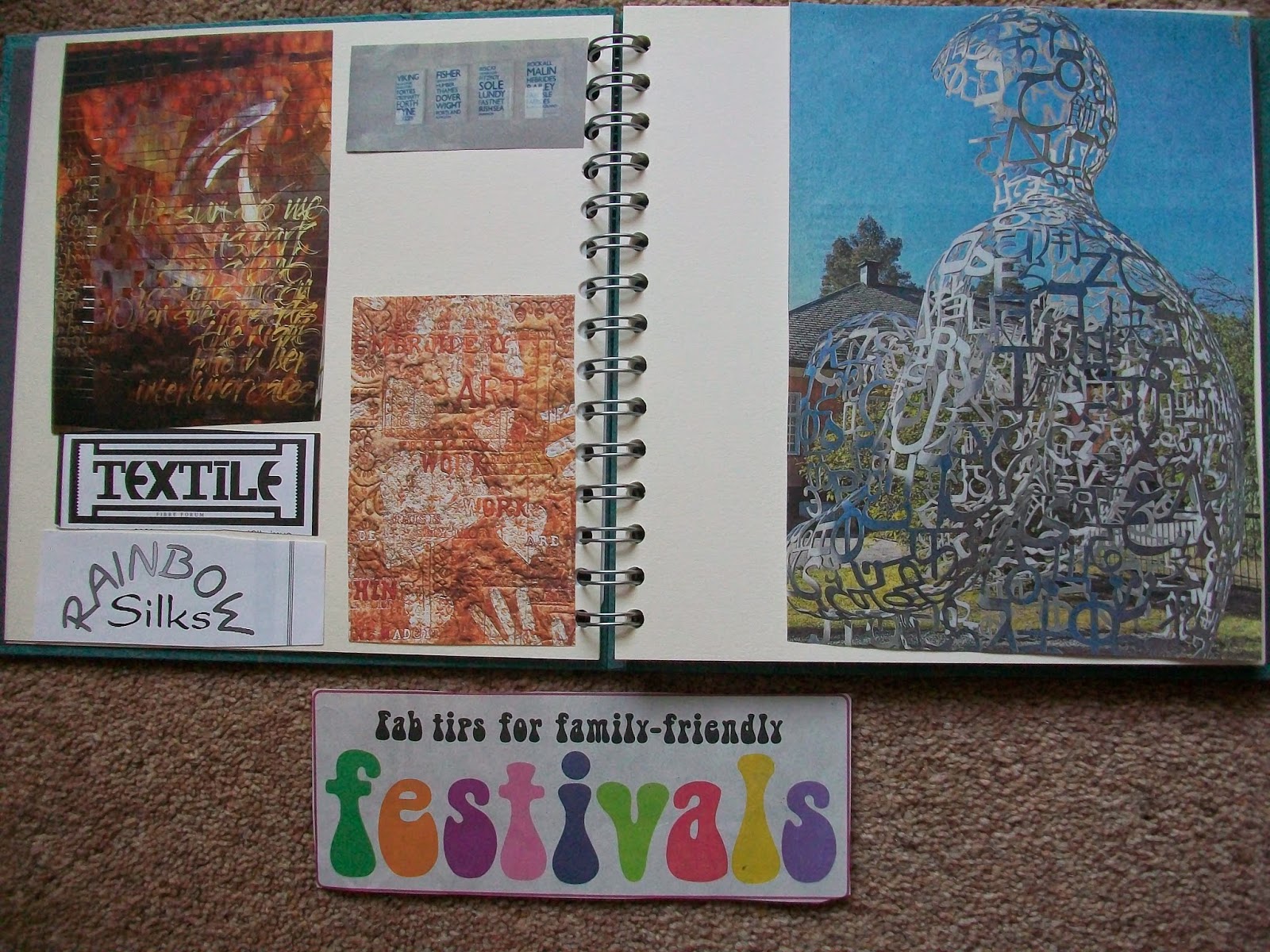
These have been cut from magazines. The two colourful ones on the left page are embroideries from an old embroidery magazine, the top right of that page is four placques with the fishing regions printed on it. The piece of artwork on the right hand page was in a newspaper and I was so excited about it, I cut it out without the information as to where it is.
I haven't printed these off yet as I thought I might try and get some more. I know a men's barber shop in town that has a wonderful font for his sign but it is difficult to get to when you are in the car.

This car belongs to my daughters neighbour. It uses letters and numbers but also different shapes to make the letters.

I was in Cambridge and did take the camera. This is joining letters together and also fitting letters inside each other (the Land the I) to make a tighter image. It also uses letters of differing sizes.
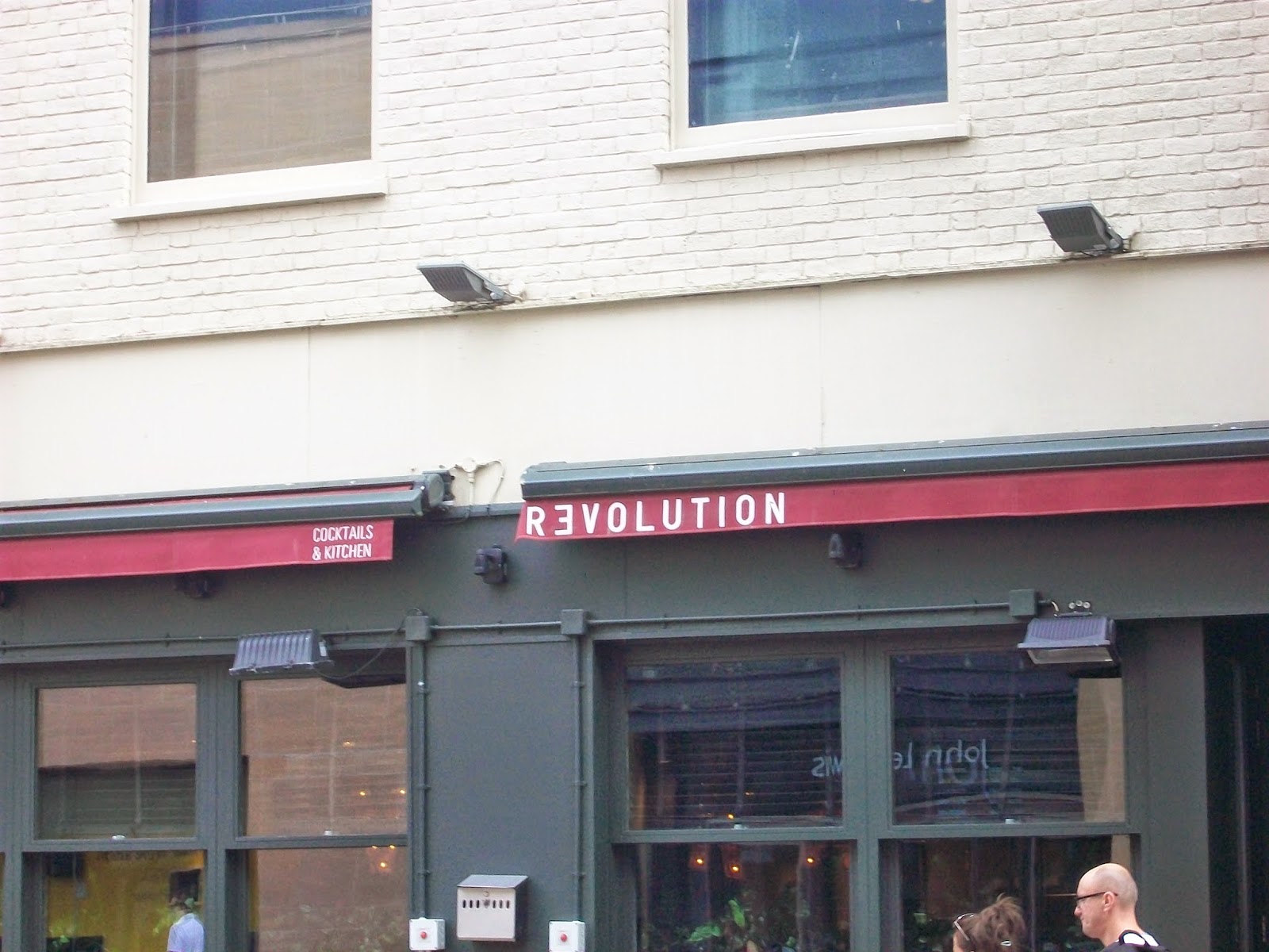
Using a letter the wrong way round.

Using letters of different sizes and an interesting font.
Activity 2.1.4 Collection of recyled papers

This is some of my paper collection.